One of the simplest and most common Excel statistical calculations How to Calculate Basic Statistics in Excel:A Beginner's Guide How to Calculate Basic Statistics in Excel:A Beginner's Guide Microsoft Excel can do statistics! You can calculate percentages, averages, standard deviation, standard error, and Student's t-tests. Read More It's a simple statistic, but it can be very informative when you want to see if two variables are related. If you know the correct commands, finding the correlation coefficient in Excel is extremely easy.
Let's take a look at the map to give you an idea of the information it gives you. We will then move on to finding the correlation coefficient in Excel using two methods and a nice graph to look at the correlations. Finally, I'll give you a very quick introduction to linear regression, another statistical function that might come in handy when looking at correlations.
Before we begin, let's discuss the definition of correlation. It is a simple measure of how things are related. Let's take a look at two variables that have no correlation at all.
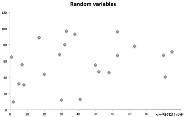
These two variables (one plotted on the X axis, one on the Y axis) are totally random and not closely related.
The two variables below, however, are correlated:
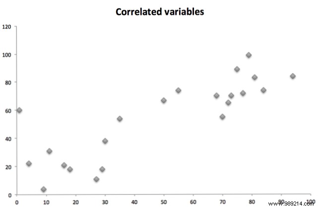
In general, as one variable increases, so does the other. That is correlation. (Note that it can also be the other way around; if one goes up and the other goes down, that's a negative correlation.)
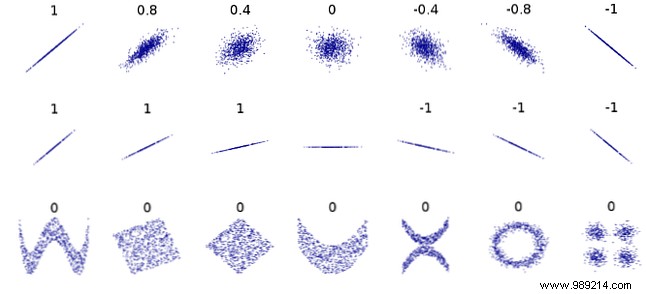
The correlation coefficient tells you how two variables are related. The coefficient is between -1 and 1. A correlation coefficient of 0 means that there is absolutely no correlation between two variables. This is what you should get when you have two sets of random numbers.
A coefficient of -1 means that it has a perfect negative correlation:as one variable increases, the other decreases proportionally. A coefficient of 1 is a perfect positive correlation:as one variable increases, the other also increases proportionally.
Any number between those represents a scale. A correlation of .5, for example, is a moderate positive correlation.
As you can see in the graph below, the correlation is only looking for a linear relationship. Two variables can be strongly related in another way and still have a correlation coefficient of zero:
There is a built in function for correlation in Excel. The CORREL function has a very simple syntax:
= CORREL (array1, array2)array1 is your first group of numbers, and array2 is the second group. Excel will spit out a number, and that is your correlation coefficient. Let's look at an example.
In this spreadsheet, we have a list of cars, with model and year, and their values. I used the CORREL function to see if the model year and value were related:
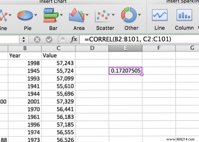
There is a very weak positive correlation; as the year increases, so does the value of the vehicle. But not for long.
When you're running correlations, it's a good idea to use a scatter plot to get a visual understanding of how your data sets are related. Go Charts> Scatter to see what your data looks like:
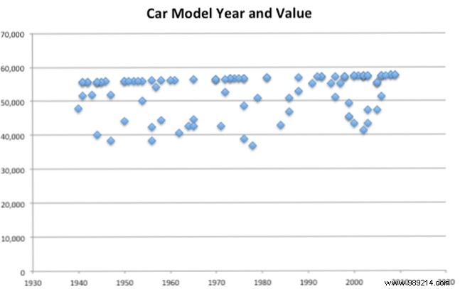
You can see that in this data, the year of the car does not affect the value much. There is a slight Positive trend, but it is weak. That's what we find with our CORREL.. function.
Another useful element in a scatter plot is a trend line, which looks like this:
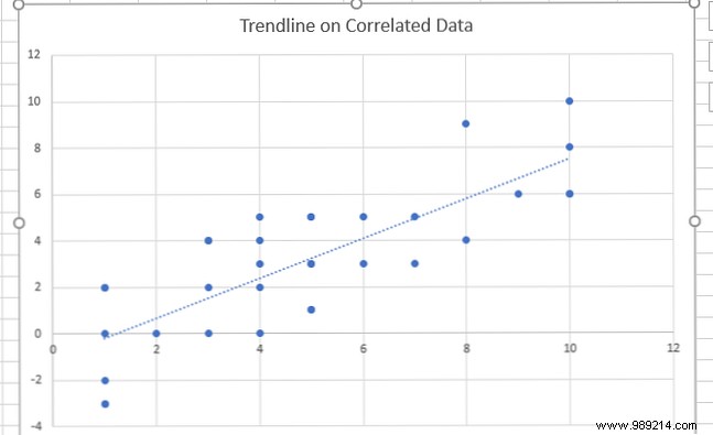
The trend line can be useful when you want to clarify the correlation on your scatterplot. On Windows, click Chart Tools> Layout> Add Chart Element and select trendline . On a Mac, you'll need to go to Graphic Design or Graphic Design , Depending on the edition of Excel..
And don't forget to check out our guide to creating great charts in Excel. How to create powerful graphs and charts in Microsoft Excel. How to create powerful graphs and charts in Microsoft Excel. A good chart can make the difference between getting your point across or leaving everyone dozing. We show you how to create powerful charts in Microsoft Excel that engage and inform your audience. Read more before submitting any findings!
If you have many different sets of numbers and you want to find correlations between them, you should run the CORREL function on each combination. However, by using the Data Analysis Toolpak, you can select a series of data sets and see where the correlations lie.
Not sure if you have the Data Analysis Toolpak? See our basics tutorial How to Do Basic Data Analysis in Excel How to Do Basic Data Analysis in Excel Excel isn't designed for data analysis, but it can still handle statistics. We'll show you how to use the Data Analysis Toolpak add-in to run statistics from Excel. Read more to download and learn how to use it.
To turn on the Toolpak, go to Data> Data Analysis . You will see a list of options:
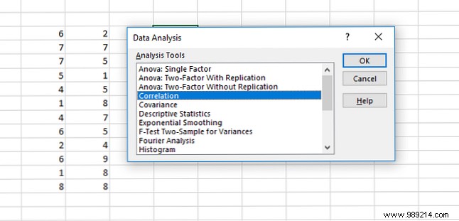
Select Correlation and hit OK .
In the resulting window, select all of your datasets in the Input Range and tell Excel where you want the results to be placed:
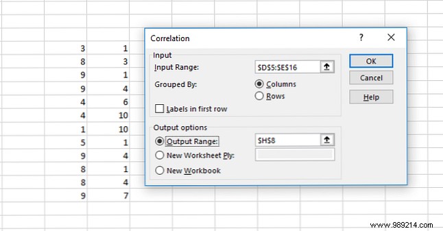
This is what you will get when you hit OK :
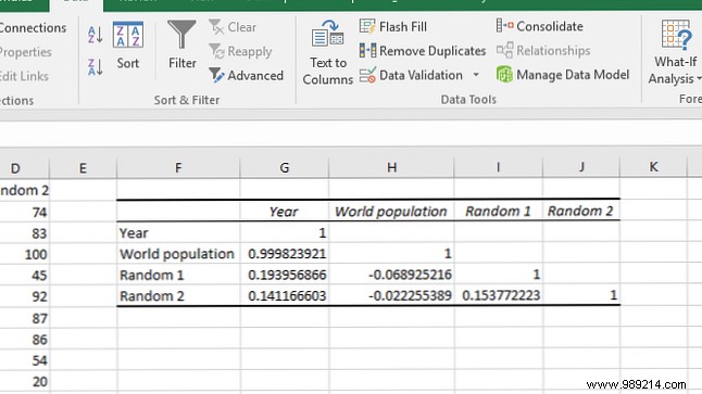
In the image above, we have run correlations on four different data sets:the year, the world population, and two sets of random numbers.
The correlation of each data set with itself is 1. The year and world population are extremely strongly correlated, while very weak correlations exist elsewhere, as expected with random numbers.
Correlation is a simple measure:how closely related are two variables? This measure, however, has no predictive or causative value. The fact that two variables are correlated does not mean that one is causing changes in the other. That's a crucial thing to understand about correlation.
If you're interested in making a statement about causality, you'll need to use linear regression. You can also access this through the Data Analysis Toolpak. (This article does not cover the details of how linear regression works, but there are many free statistical resources. Learn Statistics for Free with These 6 Resources. Learn Statistics for Free with These 6 Resources. Statistics has a reputation for being a difficult subject to understand But learning from the right resource will help you understand survey results, election reports, and statistics class assignments in no time Read More
Open the Data Analysis Toolkit, select Regression , and click OK .
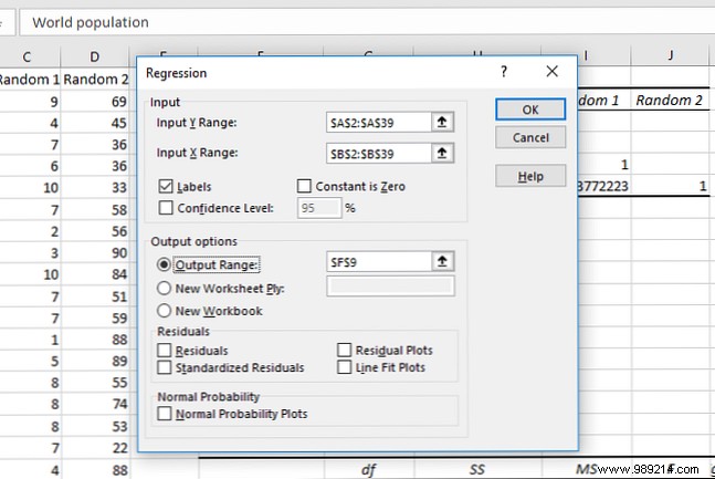
Fill in the X and Y ranges (the X value is the explanatory variable, and the Y value is the value you are trying to predict). Next, select where you want your output to go and click OK again.
The number you'll want to focus on is the p-value for your explanatory variable:
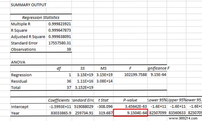
If it's less than 0.05, you have a strong argument that changes in your X variable are causing changes in your Y variable. In the image above, we've shown that the year is a significant predictor of world population.
Linear regression is also useful because you can look at multiple values. Here, we have used regression to see if year and population are significant predictors of the price of crude oil:
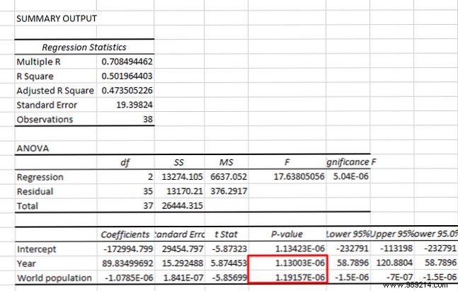
Both p-values are less than 0.05, so we can conclude that both the year and the world population are significant predictors of the price of crude oil. (Although strong correlations between X variables can cause their own problems.)
Again, this is a very simplistic explanation of linear regression, and if you're interested in causality, you should read some statistics tutorials.
But now you have an idea of how to go beyond simple correlation if you are looking for more statistical information!
Understanding the basic statistical functions in Excel can help you get a lot more useful insights from your data. Correlation is a simple measure, but it can be of great help when you're trying to make claims about the numbers in your spreadsheet.
Of course, you can run a bunch of other more complicated steps. But unless you're comfortable with statistics, you'll want to start with the basics. 8 Tips to Learn Excel Quickly 8 Tips to Learn Excel Quickly Not as comfortable with Excel as you'd like? Get started with simple tips for adding formulas and managing data. Follow this guide and you'll be up to speed in no time. Read more.
Do you use Excel's correlation functionality regularly? What other statistical functions would you like to learn?